

Visual Identity Development for Bridgebeam Lincoln
Jan–Feb 2023
Mission Statement: The mission of the Bridgebeam Family Resource Center is to provide a safe and supportive location to partner with youth and families who are struggling and need connections to behavioral health services and community resources in order to move from crisis to stability.

Logo Development
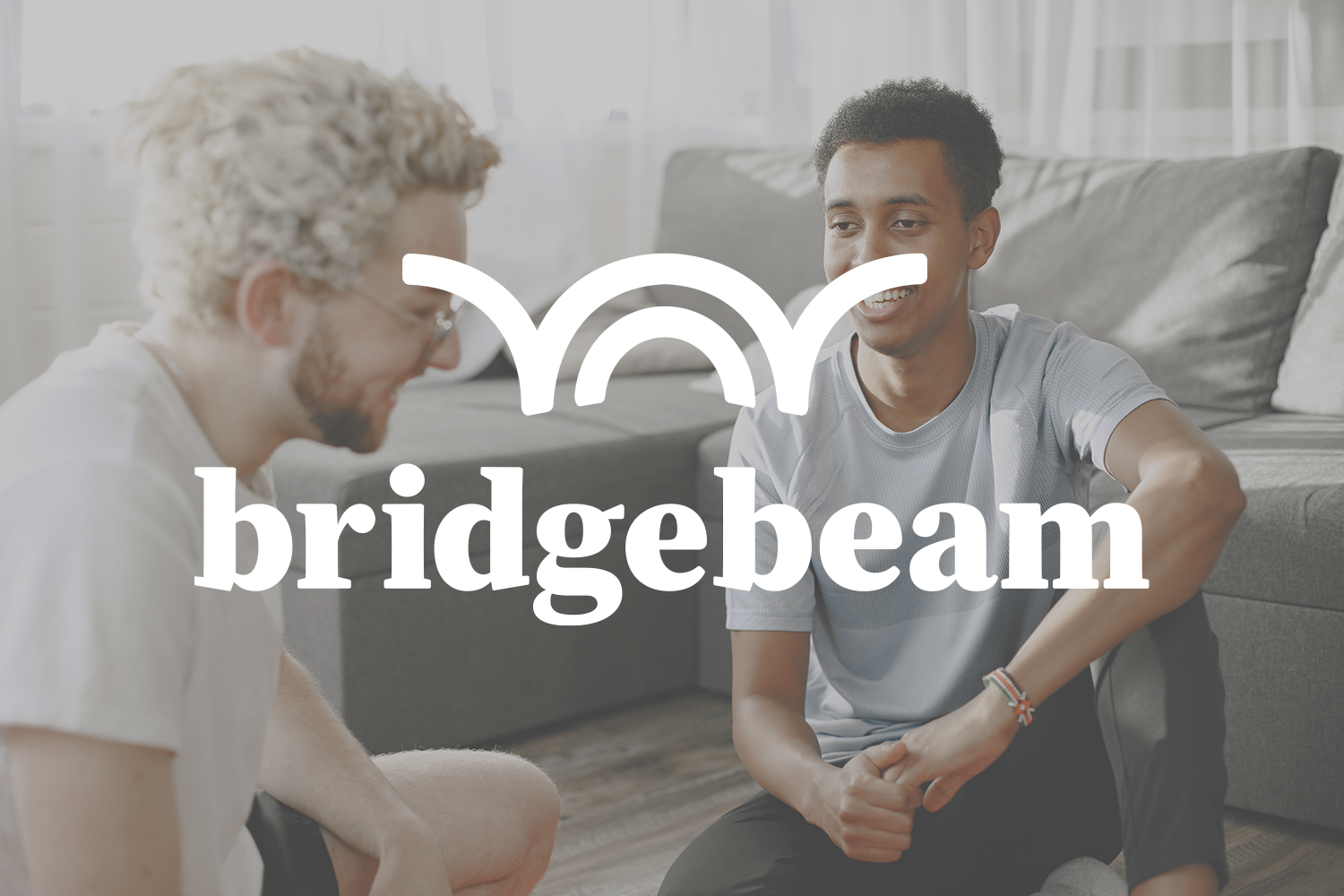
Through my iterative sketching process, I concluded upon a combination wordmark logo for Bridgebeam’s physical location and web services.
The logo needed to connect the object suggested by the name with the more abstract ideas of mental health, stability, and community. Overall, the brand should exude trustworthiness without feeling institutional, and vibrance without feeling infantile or patronizing.
Digitization
As a standard practice, I select my strongest 2–3 sketches to digitize and pair with type.
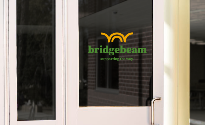
The ideal symbol should represent both a bridge and the rising sun.
Inspired by a stone arch, the logomark sums up what Bridgebeam stands for: a bright, well-supported path forward for all, with open arms to our community.
Fine Points
Even the smallest changes during type manipulation can influence the brand’s overall tone. These serifs were specifically shifted upward to add an aura of strength to the logotype.

Solution
The resulting logomark and logotype were chosen to convey a gently welcoming tone of trust with foundational strength and balance.
Shades of green and golden yellow evoke harmony, presence, and hope. They’re also fittingly Nebraskan.

Designed by August VanCleave ©2023